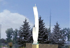
What are the gateway markers trying to say?
I don’t even know where to start with this one.
Maybe a few questions.
What does this gateway marker say to visitors?
What does this gateway marker say to residents?
How do the materials that it is made of relate to our city?
Why was the designer not not from Windsor?
Can we
People can go on about it being art but I use a definition of art that I actually heard from Steve Martin (yes, the comedian) while visiting his extensive art collection.
Art must meet two criteria that may seem to conflict on the surface but don’t
1. It makes an impression
2. The more you look the more you see.
I guess you could say these markers make an impression but thats about it. The impression ot me is a cold and sterile one of a shard of steel.
I guess we’ll run into the same problem of needing slogans and logo’s that try to be all things to all people. When will we learn that when you try to be all things to all people you end up being nothing to nobody!
Just like not being able to simplify the name of our tourism agency to anything less than Tourism Windsor, Essex, Pelee Island, kingsville, leamington, amherstburg, tecumseh……oops, I let that one get away from me, but how many readers here actually know where we do stop or should have stopped.
Take a chance, Make a statement that pisses off 10% of the population but takes care of 90%. Thats what Austin did when it pronounced itself Live Music Capital of the World that had the guts to exclude those who didn’t care about live music knowing they would still benefit.
I think a couple of closed fingers and thumb on either side of the shorter shard of steel will show what we think of this marker


$500,000 could do so much more if it were actually invested into the arts community. Open up galleries, sponsor artists, hold competitions. I agree with you Mark, we should be supporting Windsor-artists and Windsor-skilled labourers.
isn’t this article kind of putting the cart before the horse. are we making these comments based on the limited detail in these pictures? what I have heard of the project is very positive. if i were to tell you that the markers were designed by a local designer, built in a local shop, wired by a local company, and installed by a local firm, would that change the aesthetic nature of the actual marker? if so then we need to break down what we’re actually knocking the city for. Wanting to do a beautification project like this? Not commissioning all aspects of the work locally (especially the art and design)? Not having the daring to do something more potent? it just seems like over scrutinizing. if we begin scrutinizing all decisions with a list of priorities there will always be a priority that knocks out areas like arts and culture. Tom…i’m sure there are many people who could say that 500K could go to far more pressing things like the downtown mission, pathway to potential, etc. rather than investing in arts community. this is one project. a positive project. this is progress and beautification. both necessary and good.
by the way…. i have no idea who designed, built etc any of the project except for some typography done by shane.
Well, I did kinda phrase my comments in questions?
If you hired local the design probably would have been different if they understood the nature of our city and its history better.
The point is that these markers don’t really say anything to me. Nothing about them seems to associate with Windsor’s past or present.
$500,000 for the local arts community, thats 5 years of $100,000 to the arts council. Or think of it funding an arts and culinary festival for 5 years that Windsor Eats is trying to get on pepsi refresh. That type of funding would put a festival on par with shores of erie. I would guess if you Give Ken Brandes $50,000 per year for 10 years and you could expand and guarantee a bigger better Epicure (not that there’s anything wrong with it now)
By the way you can vote for windsor eats pepsi refresh for
http://www.refresheverything.ca/windsoreats
This is what I want to see!!! http://bit.ly/hVS4QN Think of it, each sphinxes could have the head of our mayor on it!
The above looks it was designed by a committee! This city involve artist, architects, designers et al - give me a break! This should have been an international design competition, then we would have really got something that would actually interest the speeding motorists.
The only thing that might save it, is a QR code on it, so you will know what you actually did miss in Windsor as you leave town.
On another thought, maybe these “guideposts” could be flesh coloured!
This is “public art” at its most typical: bland and durable. I have to agree with the editorial in today’s Star. And if the materials and designers were local, it wouldn’t make any difference. Why not give each gateway a theme? Maritime; automotive; “green” economy; War of 1812… Make it say something other than “welcome to the land of government-sanctioned art by committee.” Don’t we already have enough empty gestures in our society? I’m not saying it has to be high-concept, it just has to be somehow relevant. Maybe we should ask some high school kids for their ideas, and then get some retired Chrysler workers to create it for us.